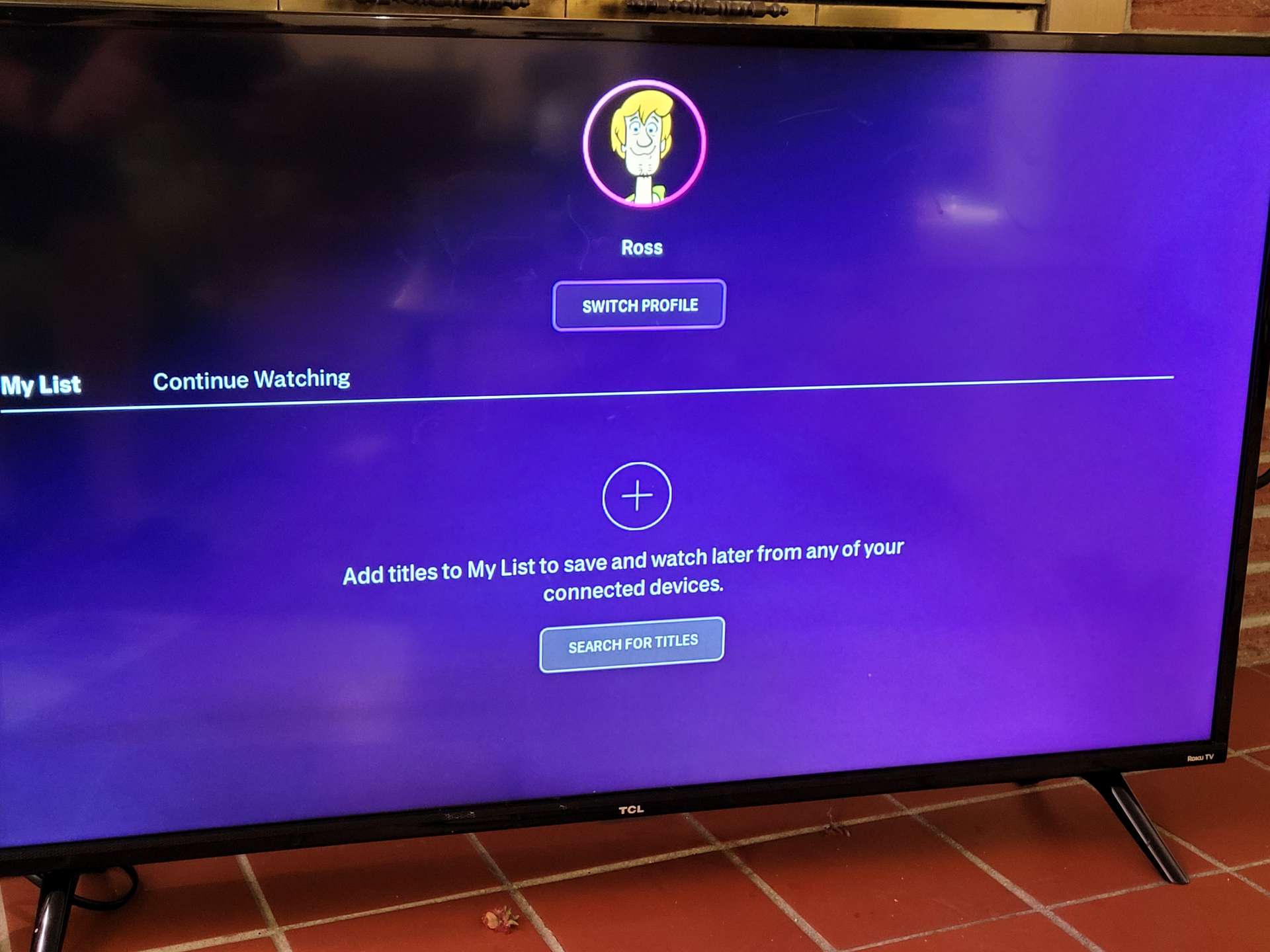
What is currently selected on this screen?
I've noticed a pattern where some tv interfaces are hard to see what is the current actively selected item. Especially ones with bright colors. Once you start clicking around it becomes apparent, but if you look away for a second it is sometimes hard to determine what is selected.
The above is Disney+ where this occurs in a few places.